

and some interesting artistic movements including: Czech Cubism and Italian Futurism.
Monday, 28 November 2011
Pepper Spraying Cop at Guernica
Thursday, 27 October 2011
The Wynwood Building

In the past 15 years this area has changed from "no-go zone" into the hub of a stimulating and vibrant scene. So far the district has managed to pull this off without becoming gentrified, touristy or kitsch. The neighborhood still has a rough edge and a connection with it roots and the surrounding areas.

For me the Wynwood Building represents a striking and welcome return to the Cubist motif's that were first developed by artists such as Otakar Kubín during Cubism's heyday in Europe before World War I.

Thursday, 13 October 2011
Wednesday, 7 September 2011
Large Interior
David Hockney's "Large Interior, Los Angeles" (1988). In this painting David Hockney applies a cubist treatment of geometry to open up the interior of a large, modern, urban living space. Here the conventional tunnel perspective of a regular image is exploded giving us a fisheye panorama of the entire space.

The viewer's attention is initially drawn to the central living area, but then begins to wander and explore, the fireplace, the kitchen, dining area, even an external deck and outdoor garden invites us toward it. The floor, furnishings, walls and all the contours of the ceiling faces are folded open but without loosing any dimention or becoming flat. Light pours through the skylights and exterior opening illuminating the main living area with bright vibrant colours.
A Hockney exhibition of Yorkshire landscapes opens at the at the Royal Academy of Arts in London next year. The exhibition runs from 21 January to 9 April, to coincide with the London 2012 Festival, for the Cultural Olympiad.

Large Interior, Los Angeles (1988) - David Hockney
Metropolitan Museum of Art, New York
Metropolitan Museum of Art, New York
The viewer's attention is initially drawn to the central living area, but then begins to wander and explore, the fireplace, the kitchen, dining area, even an external deck and outdoor garden invites us toward it. The floor, furnishings, walls and all the contours of the ceiling faces are folded open but without loosing any dimention or becoming flat. Light pours through the skylights and exterior opening illuminating the main living area with bright vibrant colours.
A Hockney exhibition of Yorkshire landscapes opens at the at the Royal Academy of Arts in London next year. The exhibition runs from 21 January to 9 April, to coincide with the London 2012 Festival, for the Cultural Olympiad.
Friday, 27 May 2011
Animaris Rhinoceros Transport
Animaris Rhinoceros Transport is a moving sculpture by Dutch artist Theo Jansen.

The sculpture is made from steel tubing with a polyester fiberglass skin. It stands just under meters 5 tall and weighs about 2 tons, yet it glides effortlessly across the ground powerd only by a gentle breeze.
Theo Jansen has been working since 1990 to create sculptures that move on their own in eerily lifelike ways. Each generation of his "Strandbeests" is subject to the forces of evolution, with successful forms moving forward into new designs. Jansen's vision and long-term commitment to his wooden menagerie is as fascinating to observe as the beasts themselves.
His newest creatures walk without assistance on the beaches of Holland, powered by wind, captured by gossamer wings that flap and pump air into old lemonade bottles that in turn power the creatures' many plastic spindly legs. The walking sculptures look alive as they move, each leg articulating in such a way that the body is steady and level. They even incorporate primitive logic gates that are used to reverse the machine's direction if it senses dangerous water or loose sand where it might get stuck. - Ted.com
Tuesday, 26 April 2011
Oh Bondage, Up Yours!

The BBC reports today the Punk Rock icon Poly Styrene, of X Ray Spex, has died today after a battle with cancer of the spine.
X Ray Spex's unique sound blended traditional punk fuzzbox guitar with the less traditional saxophone and the wailing vocal skills of Poly Styrene. The experiment was short-lived. Like many of the best Punk bands of their time they released just one album, Germ Free Adolescents, in 1978. Their music influenced and inspired a generation and is as powerful and poignant today as it was 34 years ago.
Tuesday, 19 April 2011
Big Dog
As the Table #1 prototype's assembly continues it begins to take on a startling resemblance to Boston Dynamics' "Big Dog" robot.


Table #1's frame, in context, awaits the arrival of the glass top and fixing screws.
Below, Big Dog in action...
Update: This project was completed in April 2011 and has been installed at a location in Titirangi, New Zealand. For more details click here.

Table #1 - Frame mockup


The above images show the table frame in pre-assembly mockup (left), then on the right, after: assembly, final sand, polish, stain, more polish and more stain.

Detail of polished table leg

Table #1's frame, in context, awaits the arrival of the glass top and fixing screws.
Below, Big Dog in action...
Tuesday, 5 April 2011
London 2012

London 1912
Vorticism was a radical literary and artistic movement which entered the London scene around 1912. It was the London art scene's avant-garde reply to Cubism and the Italian Futurists, acknowledging the machine age and Britain as the first industrialized nation.
The Vorticists attempted to shock English society out of its polite acceptance of timid aesthetics...
BLAST years 1837 to 1900 Curse abysmal inexcusable middle-class (also Aristocracy and Proletariat)...WE WHISPER IN YOUR EAR A GREAT SECRET. LONDON IS NOT A PROVINCIAL TOWN. We will allow Wonder Zoos. But we do not want the GLOOMY VICTORIAN CIRCUS in Piccadilly Circus.
...wrote Wyndham Lewis in the Vorticist magazine, BLAST (1914).

BLAST cover (1914)

In a Vorticist painting modern life is shown as an array of bold lines and harsh colors drawing the viewer's eye into the center of the canvas. The Vorticists wanted to place the machine age at the very center of their work. BLAST proposed that they fill their art with ‘the forms of machinery, factories, new and vaster buildings, bridges and works’. Richard Cork (Oxford University Press)

(above) Portrait of an Englishwoman, W. Lewis;
(previous image) Abstract Design, W. Lewis (1913)

The Arrival, C.R.W. Nevinson (1913)

Head, Frederic Etchells (1914)
Vorticism, as a coherent movement, was cut short by the arrival of World War 1. But its influence in art and literature was far reaching and long lasting. It affected many, from literary giants such as T.S. Elliot to the anti-establishment revolution of Punk Rock.

London 2012
2012 marks roughly 100 years since the beginning of London's Vorticism art movement. The logo, to represent the London games, is a jagged emblem based on the date 2012. It was designed by the Wolff Olins agency of London. Instantly controversial and despised by Joe public it is undoubtedly bold, modern and vibrant. A connection to the Vorticist ideals and imagery of 100 years ago seem clear and, in my mind, appropriate.
I am not sure if the London 2012 Olympic committee would be comfortable being associated with the radical Vorticists of 100 years ago any more than the Vorticists would be happy with Vorticist imagery being used to promote Olympic sports...

Exert from BLAST (1914)
On the other hand, Ezra Pound also declared in BLAST that ‘the vortex is the point of maximum energy. It represents, in mechanics, the greatest efficiency. This is perhaps something that sits more comfortably with the modern Olympic movement.
Controversy
The 2012 logo has been instantly criticized from all quarters, from the press to the politically correct. The first victim to fall to the PC Nazis was the logo's utterly brilliant introductory video, with everyone from the concerned parents brigade to mayor Ken Livingstone claiming it would cause epileptic seizures and must be scrapped, and so it was. Judge for yourself below...
Many people simply considered it to be ugly, others joked that it depicted the act of fellatio. One of the more absurd claims came from Iranian Olympic officials that the logo was a secret depiction of the word "ZION" and threatened to boycott the games if it was not changed.
I consider all of these objections as vindication that the London 2012 logo was, finally, an inspired and courageous choice.
Sources
- Il Vorticismo (Londra 1912-15), Storia dell'avanguardia antagonista del Futurismo - by Raffaella Picello
- BLAST, Review of the Great English Vortex, (1914) Wyndham Lewis & all
- Vorticism.co.uk
- Wikipedia: Vorticism

Wyndham Lewis
Thursday, 10 March 2011
Desk #1

Desk #1 is an office desk that is designed to wrap around whoever is sitting behind it. It is divided into two main parts: a massive steel frame and a wooden top. It is a contradictory design which is simultaneously minimal and over engineered.
It is minimal in the sense that the top has very clean lines and appears to be floating, as if suspended just inches from the massive steel frame that supports it. The legs of the frame are built from large diameter steel tubing. These support hidden struts that bolt to the horizontal steel frame which supports the wooden top. This is what gives the illusion of a floating top.

The top was constructed by heat-bending strips of wood around a former and laminating them together. The shape of the top radiates outward from whoever is seated at the desk. The original setting for this desk was a fan-shaped office room which also radiated outwards towards a window space with panoramic views.
Desk #1 in its new setting
First design sketches for desk #1 were completed not long after September 11, 2001. In the original design the steel legs were shaped as a tribute to the twin towers of the World Trade Center in New York. The two legs on the right were positioned close together and extended up high above the surface of the desk. The legs on the left were to be formed using the same steel tubing but in a twisted and distorted shape.
During construction I found that this design had to be modified. The two tall legs on the right were imposing, making the desk feel claustrophobic, so these were trimmed down. The twisted curves were too time consuming to construct. Instead I opted to use uneven sized legs on the left, one leg not even reaching the bottom of the desk, the second leg protruding through a hole in the top left corner. The shorter leg was later adapted to carry a mini computer case (as shown in the photos).
Desk #1 can be disassembled using a few simple tools, carried by one person and transported flat inside a small hatchback car.
Saturday, 12 February 2011
Table #1 - Final Version
The Table #1 - Taraire design has is finalized, detailed and is currently under construction.

Other than detailing, then main change over the initial concept is the addition of a strut across the two under hanging frame apexes. This was unavoidable in the interest of structural rigidity.


Other than detailing, then main change over the initial concept is the addition of a strut across the two under hanging frame apexes. This was unavoidable in the interest of structural rigidity.

Monday, 24 January 2011
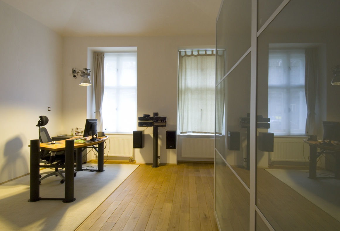
Audio Center #2

The mess of gadgets pictured above is a functional prototype of what will eventually become a modern visual interpretation of Luigi Russolo's mighty Intonarumori.

I will update this blog periodically as the design for Audio Center #2 takes shape. In the mean time you may enjoy Karheinz Stockhausen's wonderfully avant garde "Kontakte" by clicking below...
Sunday, 16 January 2011
Table #1 - Taraire Variation

This variation of my Table #1 design is currently under construction for an installation in Auckland, New Zealand.

A glass top was chosen to emphasize the angular, triangulated construction of the legs. These will be polished and colored to match the exposed rafters in the apartment's ceiling space.

The table will be located in a fairly tight space, so using a glass top also helps to prevent the table from overfilling its space.
Subscribe to:
Posts (Atom)